
*Updated May 29 with the release of the Atletico Ottawa Home kit*
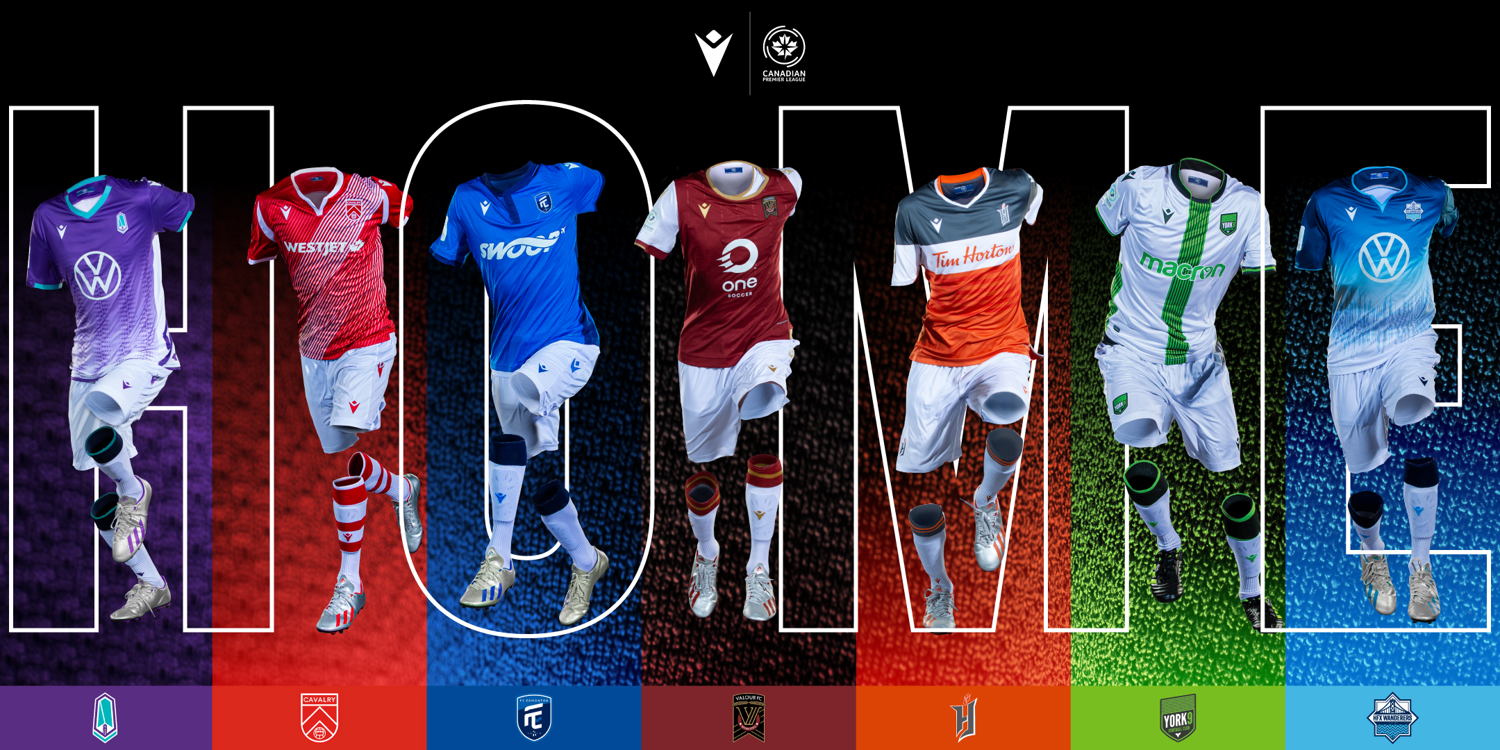
Every year teams bring out new kits. This 2020 CPL season is no different as they have released the home kit for seven of their eight teams.
Seven of the eight clubs released their home kits on February 28. Like the first season, teams didn’t have a whole lot of history to go off of.
Some made some good decisions and improved their home kits. Some made some really bad decisions and ruined their home kits. Let’s take a look at the good, the bad, and the downright ugly.
The Ugly
Forge FC’s Home Kit
Why not start with the champions from last year right? Forge FC had a clean look in their inaugural season. Solid orange home kit with the three diamonds from their logo sublimated in the back ground in a darker orange. It was a look that saw them hoist the first North Star Shield.
Unfortunately, they decided to make some drastic changes to their home kit, and none of them are good.
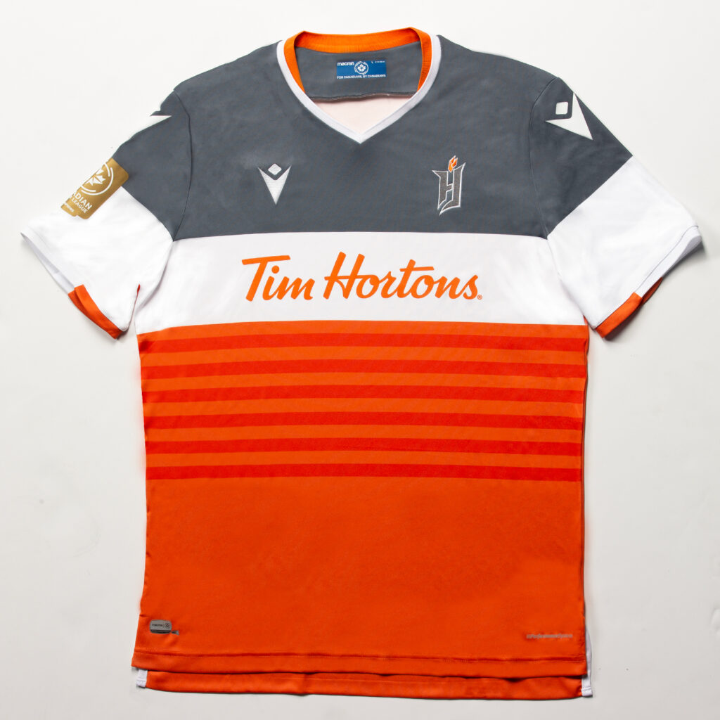
Shying away from the single tone, Forge decided to include every possible colour from their colour scheme. Two different tones are used to create six stripes, signifying the regional municipalities that make up Hamilton. While the two-tone orange is fine, pairing that with the white and grey is sensory overload to the eyes.
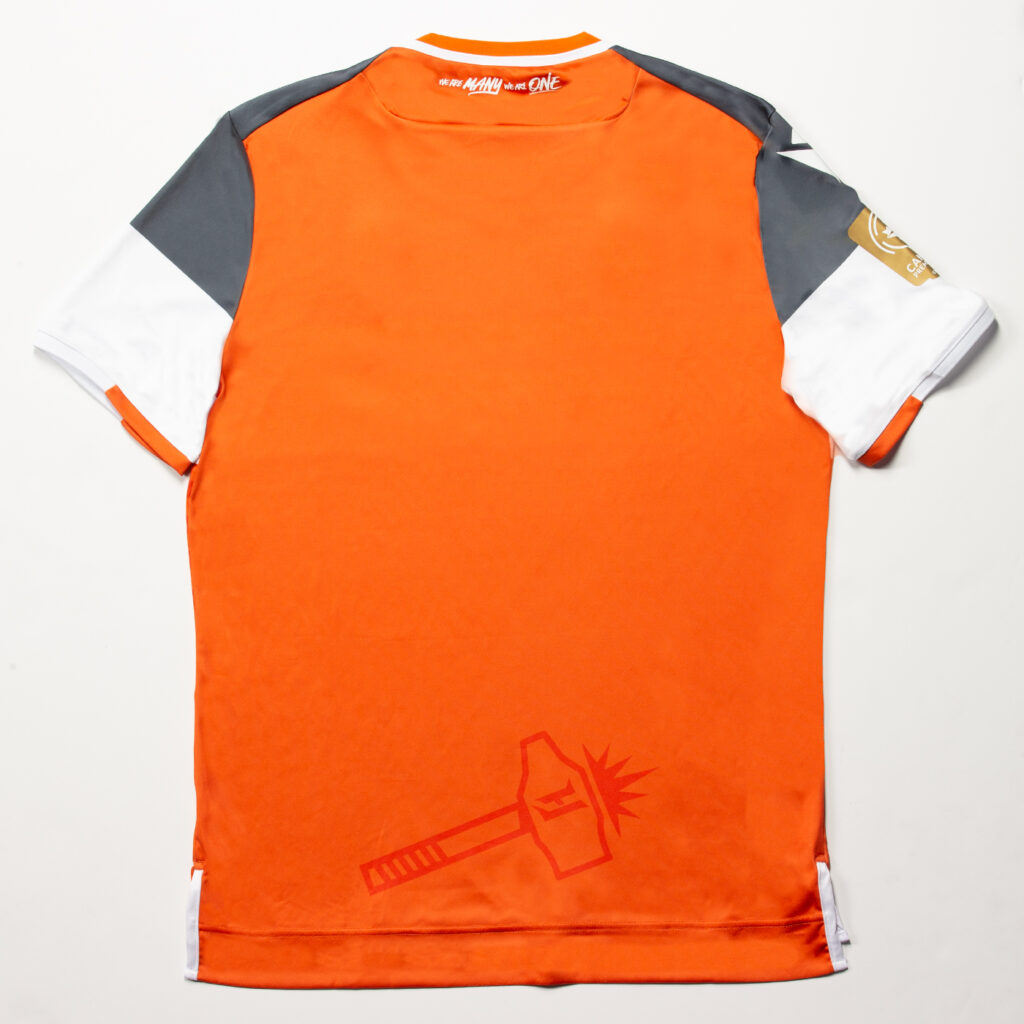
The back of the kit is fine. The two-tone orange is used once again to include the secondary logo. If they had followed the same idea on the front that they used on the back, these kits wouldn’t have as many problems.
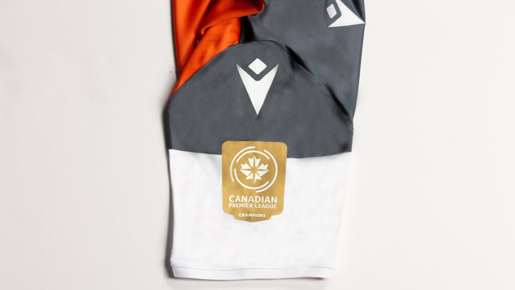
One of the nice additions to the kit from the league is the champions patch. Something the league has said will continue moving forward. The winner from the previous season will receive the gold patch (shown above) with the winners from two seasons prior receiving a different patch moving forward.
The Bad
A few teams just missed on their new home kits. Some made small changes that made their new threads worse. Some went drastic changes but they didn’t make the kits themselves that horrible in the grand scheme of things.
Cavalry FC’s Home Kit
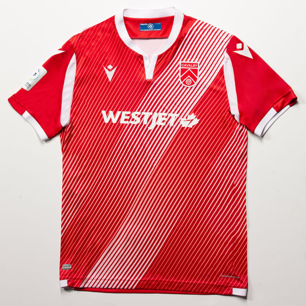
Keeping with their first kits two tones, Cavalry just missed on these. The iconic sash that saw them win both the spring and fall season last year has been replaced with multiple faded, striped sashes. While it isn’t a horrendous look, it doesn’t have the same solid look from their first kits.
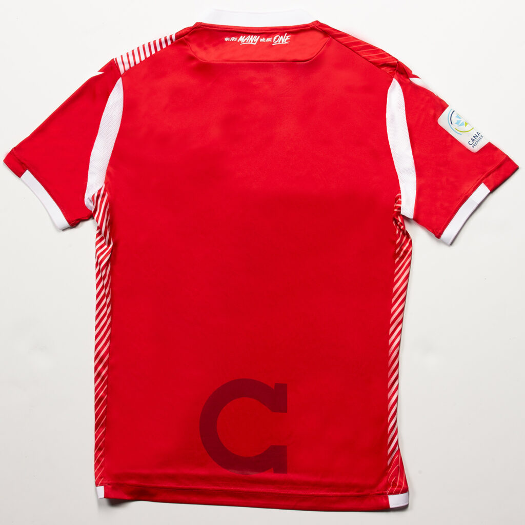
Like Forge, Cavalry went with a single colour back with their secondary logo in a second red tone. A clean back with what we are to assume will have white numbers and names. So close but unfortunately they fall just short of being good this year.
FC Edmonton’s Home Kit
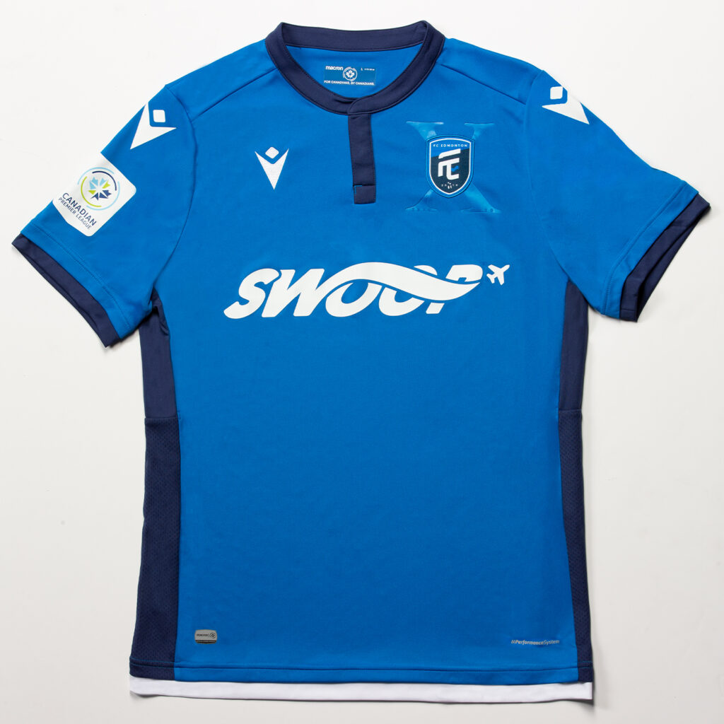
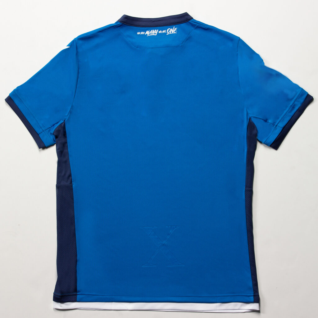
The winner of this season’s most plain jersey goes to FC Edmonton. Gone are the dark blues emblazoned with a lighter blue wave. Coming in are a solid lighter blue kit with a dark blue collar and sleeve ends. They also put a dark blue stripe down the side. Why they decided to completely switch their colour scheme for this kit is something that should be asked. But either way there isn’t much to them. One nice thing is the constant colour scheme on front and back.
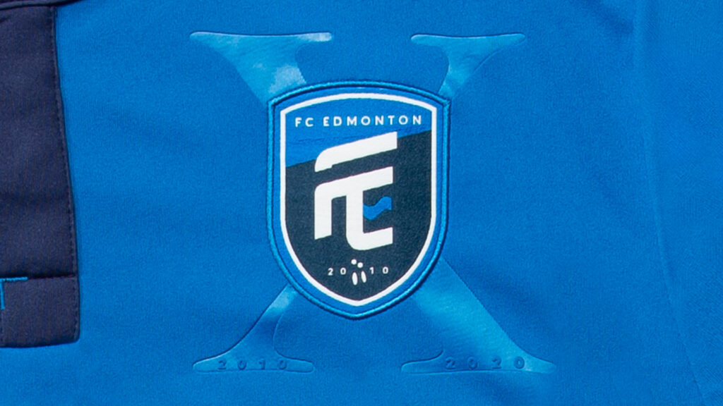
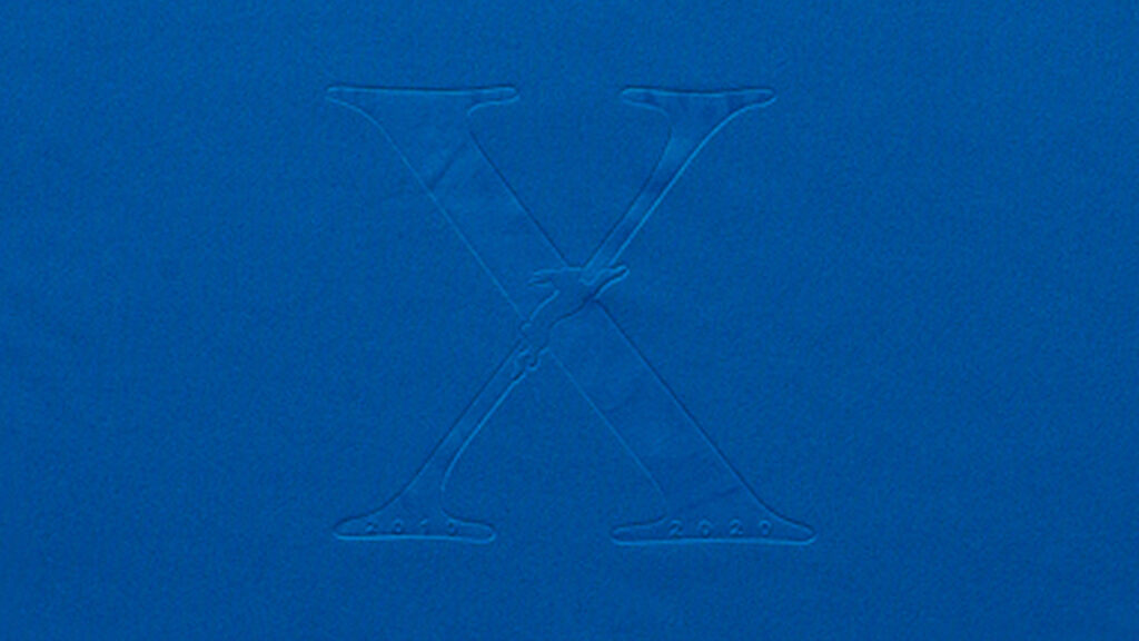
One thing Edmonton did well was utilize symbols. While it may only be a single symbol, the X behind the logo on the front and on the bottom hem is a nice touch. The “X” represents the ten years of FC Edmonton across three leagues.
Valour FC’s Home Kit
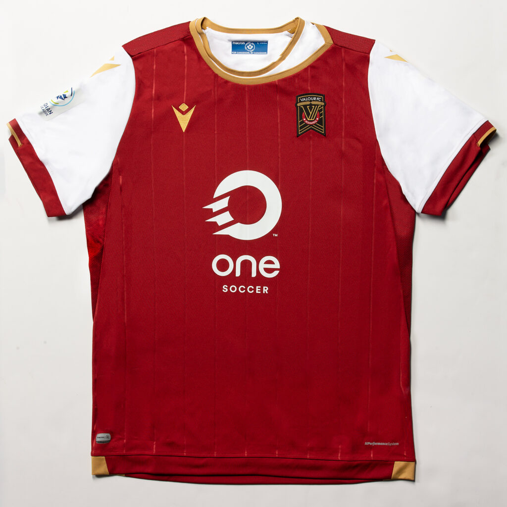
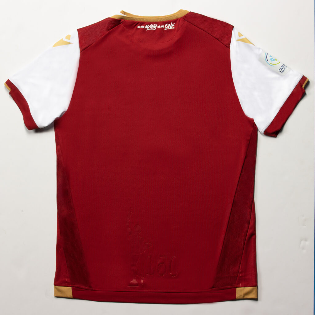
Just narrowly falling into the bottom half of the designs is Valour FC. While the design elements themselves aren’t bad, the execution is what got this kit in the bad category. Any fan of pinstripes would agree that they need to be seen. Unfortunately the pinstripes on this kit are tonal and get lost in the overall look. Macron and the CPL have experience making a clean pinstripe look (see FC Edmonton’s second kit from last season) so this seems like a huge miss.
The collar on this kit is also a question mark. The yoke on the left side looks like someone stretch the neck line only on the one side and decided to wear a white shirt underneath. With the clean look of pinstripes, when you can see them, the collar doesn’t fit.
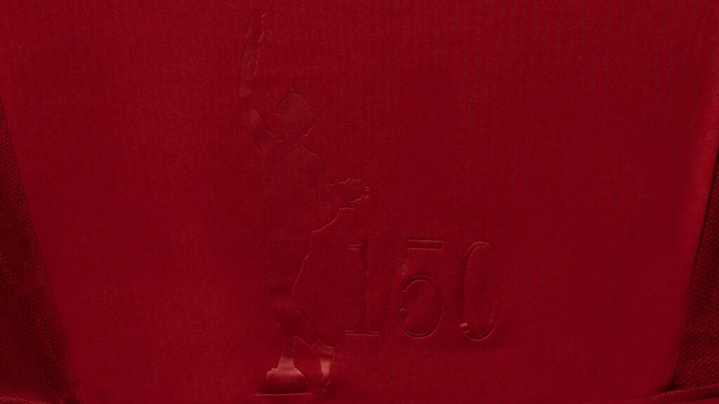
While the pinstripes and the collar drag this down the list, there are some great elements to this kit. Like many of the kits the back logo is clean and tonal. For Valour FC they decided to do something unique to their city. With Winnipeg celebrating their 150th anniversary this year, Valour emblazonzed the famous Golden Boy from the Manitoba Legislative Building and the number 150.it is a nice homage to the city and a way to connect even further with the fanbase.
The Good
Now to the good. Every year there are teams that stand out and make a big splash with their kits. This year was definitely now exception with three beautiful kit designs.
Pacific FC’s Home Kit
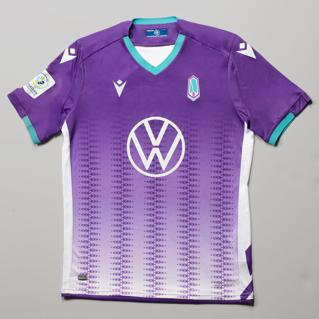
One of the nicest looks last year is completely gone. In its place is a two-sided kit with multiple unique details that make Pacific FC’s kits a win again.
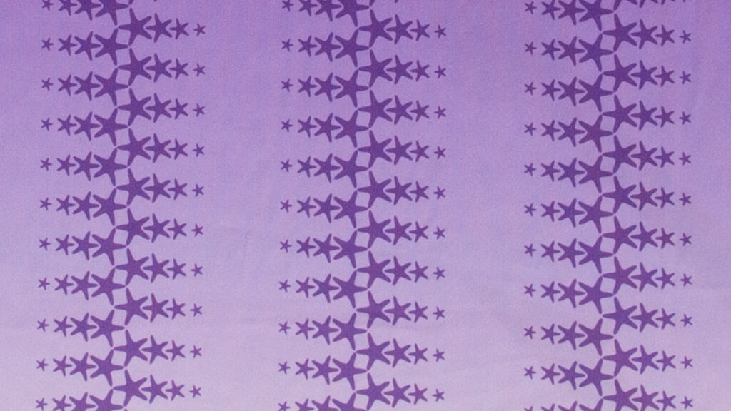
Gone is the two tones of purple, as Pacific went with a faded front this season. Running up and down the front of the jerseys are columns of stars (see above) in the iconic purple of the squad. With a simplified collar utilizing their teal colour, the front of the jersey showcases another clean look.
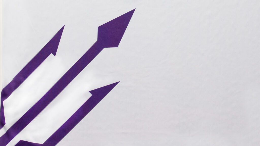
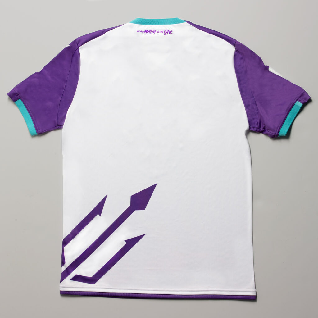
The back of the kit is a solid white colour. Poseidon’s trident is coming out of the left hip to signify the Pacific’s control of the game as well as protecting the island they play on. Another way to connect to the city that has welcomed them home.
York9 FC’s Home Kit
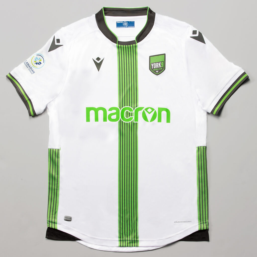
In the most dramatic and best change of the season, York9 easily went from worst home kit last year to one of, if not the, best in year two. After a year that saw them have too much on their kit, the brass decided to simplify.
With the only home kit to be white, York will definitely be unique once again. The nine stripes representing the nine regions that make up York are flipped vertically down the middle of the kit. This middle stripe does a great job breaking up the solid white kit. They also put the nine stripes down each side of the kit which is a great touch on these.
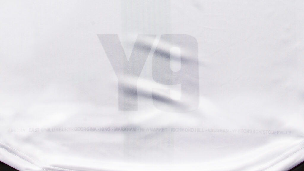
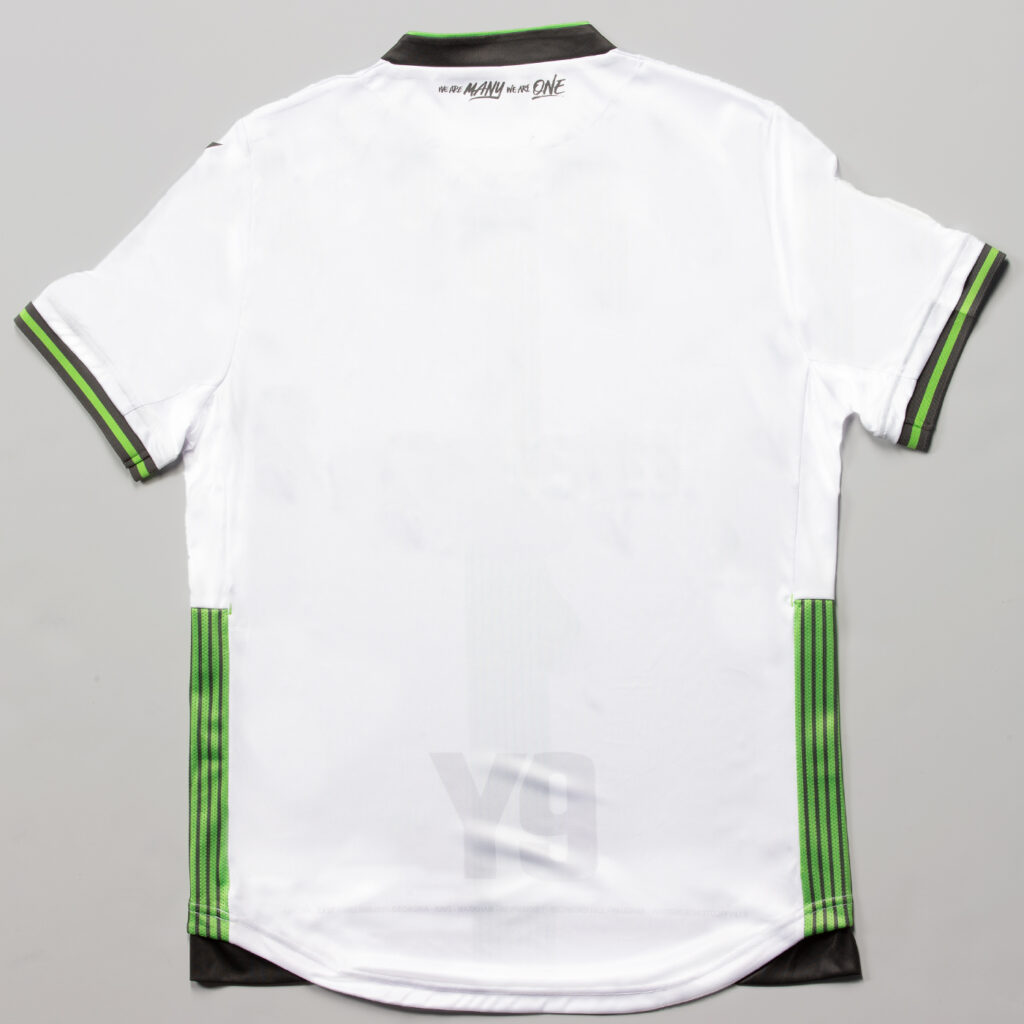
Another beautiful lower back logo is used on the York kit. An off-white secondary logo (Y9) is combined with the names of the nine municipalities to really drive home the idea of togetherness. While it is almost hidden it is a nice touch.
HFX Wanderers FC’s Home Kit
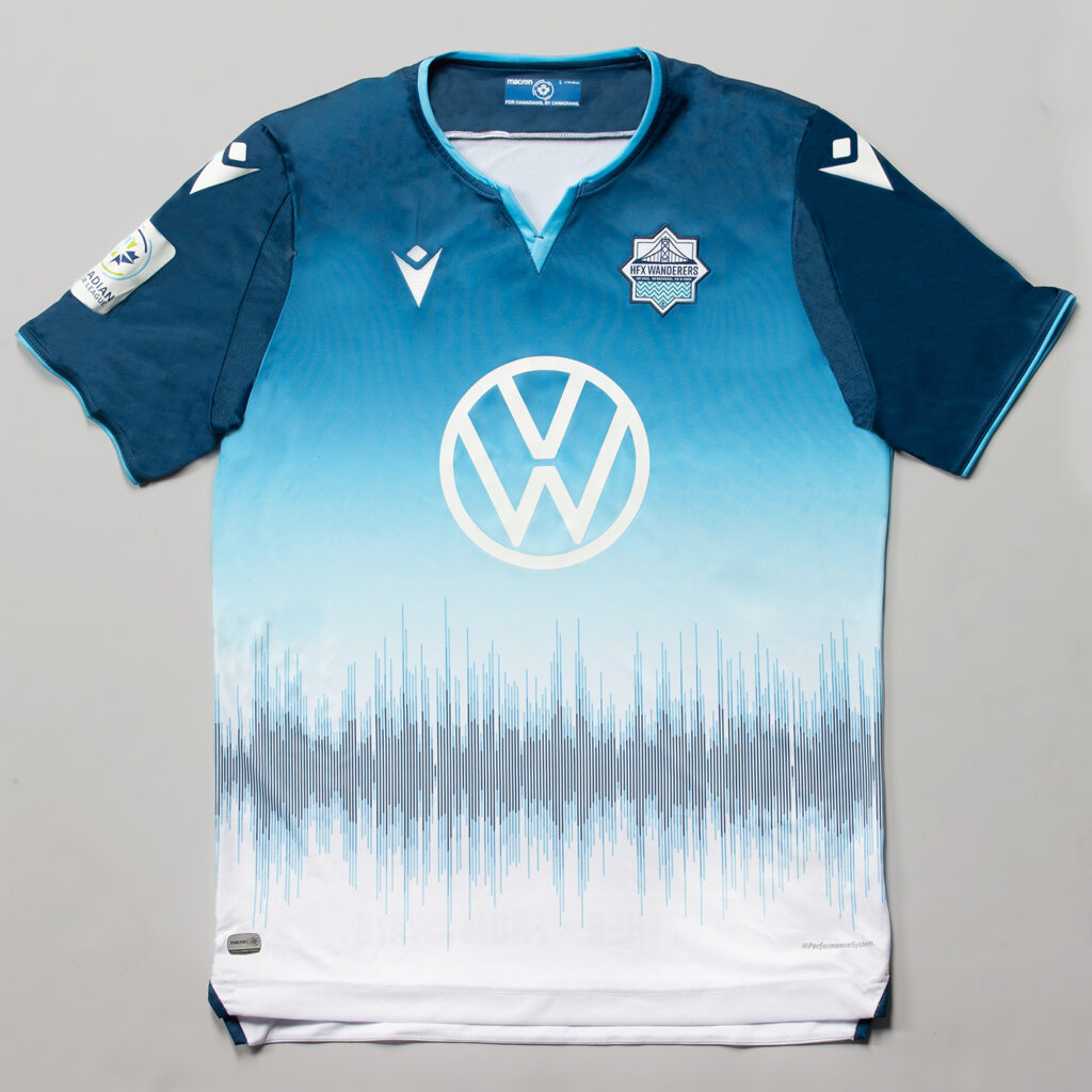
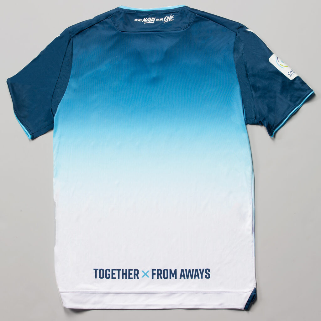
A team that had one of the best kits last season, HFX Wanderers FC, followed that up with another hit. Another team that went with a fade, the changes between the blues to the white on both sides is inspired by the Atlantic Ocean and the Light of the Halifax Sky.

The most unique element of any jersey this year is the on the front of the HFX’s jersey. A soundwave from the famous song, Barrett’s Privateers by Stan Rogers, is shown across the kit in both blues of HFX. With this song being so iconic in Halifax, it is one of the strongest elements on any jersey.
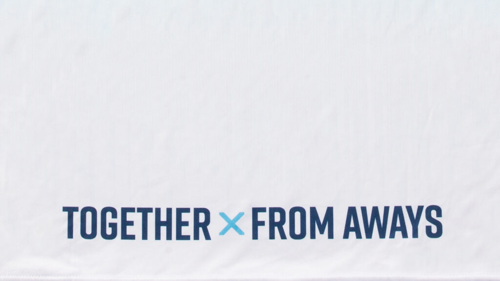
Another element that HFX included in their back logo. “Together x From Aways” is written across the back of each kit. The saying brings together the player and fans that are from all of the province, country and of course the world. It is the small cherry on top for this beautiful kit.
Atletico Ottawa
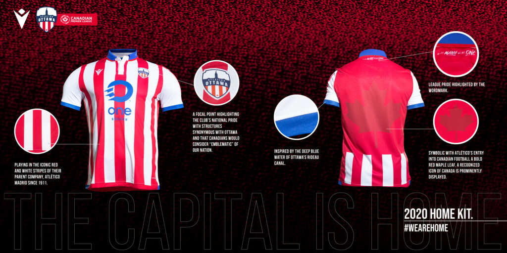
Finally, after months of waiting Atletico Ottawa has released their home kit. And it is exactly what everyone expected it would be, which isn’t a bad thing. The club will take the inspiration from their parent club Atletico Madrid and don the red and white vertical stripes. A clean and iconic look, and one that is easily recognizable.
The blue collar is also like the 2014/15 Madrid kit but with the bonus of representing the Rideau Canal, one of the prominent geographical landmarks in Ottawa. While some may say it is a cop out to say it is for the canal, it is nice of the designers to try and make it seem Canadian.
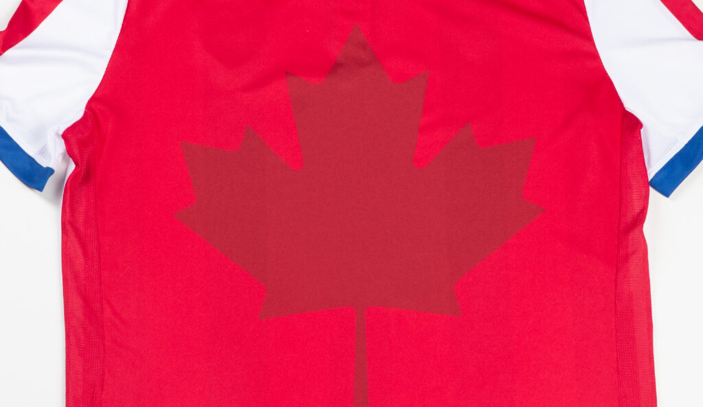
Like all of the kits in the league, Ottawa went with a sublimated logo on the back. To keep it simple they will have a darker red maple leaf beneath their numbers as a symbol of the great nation they play in.
League
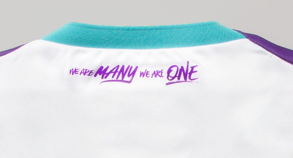
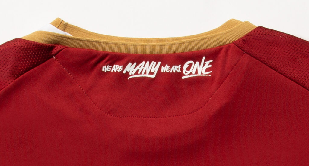
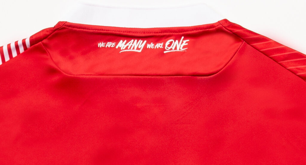
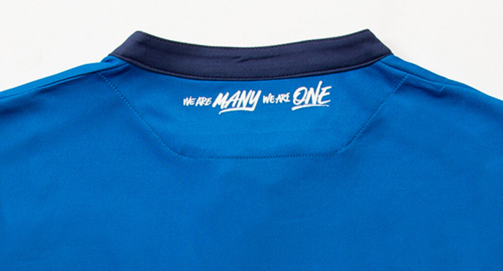
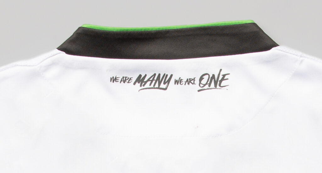
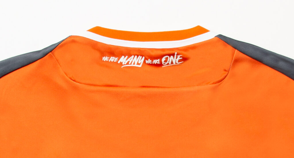
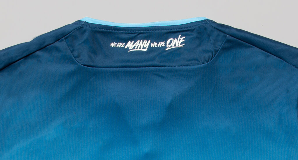
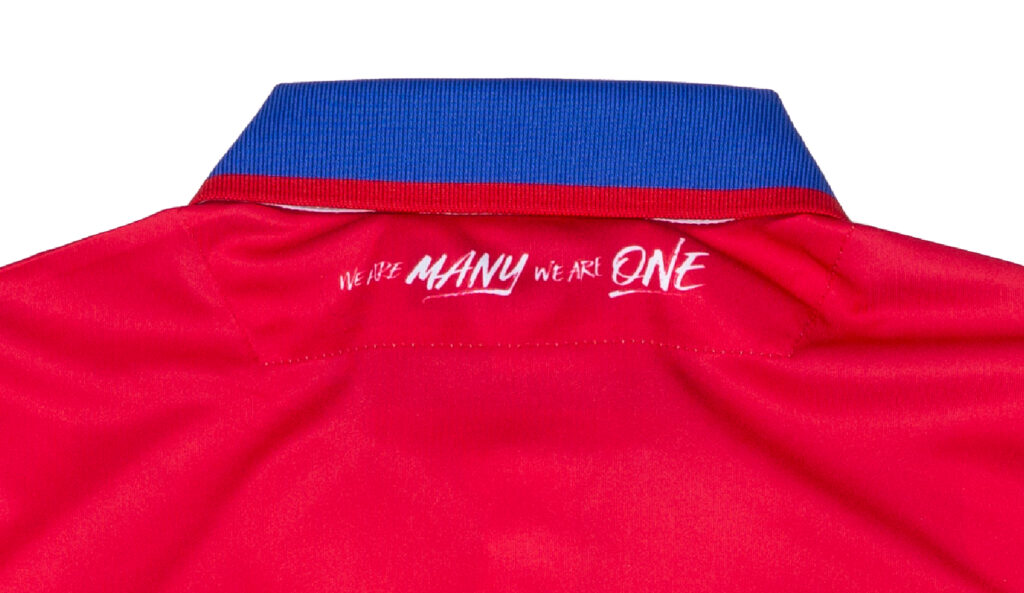
In a show of unity, each club has the league tagline written on the back shoulder of the kit. The tagline “We Are Many We Are One” is about what the league represents and is a nice touch to cap off this season’s kits.
Away Kits
The away kits for all the clubs will also be released before the season starts. There is no indication of when the league will be returning after the COVID-19 outbreak.